Presenting the risk adjustments
The risk adjustments can be presented in a number of ways. Examples of two of the more common presentation formats are shown below.
EXAMPLE 1: | |||||
A table that represents risk as a percentage of the total risk adjusted PSC can be useful in showing the spread of risk between the Best. Most Likely and Worst Cases. | |||||
| Description | Best Case | Most Likely Case | Worst Case |
|
| Retained risk | 0% | 2% | 5% |
|
| Transferable risk | 7% | 26% | 41% |
|
| Total risk | 7% | 28% | 46% |
|
Note that the range between the "Best Case" and the "Worst Case" are for illustrative purposes only, and each project will differ in its range. | |||||
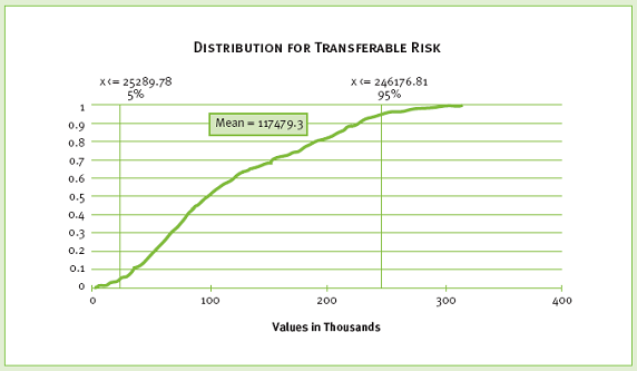
EXAMPLE 2: |
The cumulative distribution chart, shown below, can be generated for both retained and transferable risk. Such charts are useful in showing the probability of the value of risk between certain outcomes. For example, the Transferable risk chart shows that the percentage likelihood of retained risk having a cost impact of less than NPV $100 million is estimated at approximately 55%.
|