5.6.1.3 Road corridors in greater Adelaide
The Audit dataset provides a broad range of data about corridors, and there are many ways of analysing this data. Given the focus of the Audit on economic indicators, the analysis in Table 72 and Table 73 focuses on delay cost. This applies a dollar cost to time delays, based on lost productivity, and takes account of the different costs applicable to different vehicle types.
Some users of the Audit dataset may prefer to use more traditional indicators of congestion, such as traffic V/C. This measure is included in the Table 72 and Table 73, as is the DEC measure, which gives insight into the underlying value of activity on the corridor, and the proportion of DEC attributable to delay cost.
These measures are expressed per lane kilometre of road. This normalises the results to facilitate comparison across a wide range of different corridor types - some very long, some consisting of multiple roads, and some relatively short single roads.
The modelling provides one method of measuring and projecting demand for transport infrastructure and the corridors identified in Table 72 and Table 73 reflect this approach. The SA Government may have utilised other data, and different methods of analysis, to inform identification of infrastructure priorities. For further information on the assumptions, included projects and methodology applied in the model, refer to the supporting documentation by Veitch Lister Consulting.
Table 72 shows corridors ranked by delay cost per lane kilometre in 2011, with the equivalent projections for 2031 in Table 73. Taken together, these tables give an indication of which corridors warrant further study, and where interventions are likely to have the biggest economic return.
Table 72: Top 10 road corridors in greater Adelaide area 2011, by delay cost (2011 dollars)
| Rank | Road Corridor | State | Delay cost by | DEC per lane km | Volume Capacity |
| 1 | Goodwood Rd Corridor | 1.63 | 4.05 | 78% | |
| 2 | Lower North East Rd/Payneham Rd Corridor | 1.55 | 3.60 | 78% | |
| 3 | Anzac Hwy Corridor | 1.53 | 4.63 | 66% | |
| 4 | Fullarton Rd Corridor | 1.51 | 3.30 | 85% | |
| 5 | Port Road Corridor | 1.36 | 4.27 | 65% | |
| 6 | Portrush Road Corridor | 1.33 | 3.64 | 81% | |
| 7 | North East Road Corridor | 1.25 | 3.86 | 63% | |
| 8 | Marion Rd Corridor | 1.01 | 2.86 | 70% | |
| 9 | Magill Road Corridor | 0.97 | 2.48 | 76% | |
| 10 | Unley Rd/Belair Rd Corridor | 0.95 | 2.40 | 70% |
Source: Infrastructure Australia analysis of data from ACIL Allen Consulting (2014b) and Veitch Lister Consulting (2014f)
Table 73: Top 15 road corridors in greater Adelaide area 2031, by delay cost (2011 dollars)
| Rank | Road Corridor | State | Delay cost by | DEC per lane km | Volume Capacity |
| 1 | Port Road Corridor | 3.40 | 7.57 | 73% | |
| 2 | Port Wakefield Rd/Main North Rd Corridor | 3.29 | 5.85 | 72% | |
| 3 | Goodwood Rd Corridor | 3.26 | 6.60 | 85% | |
| 4 | Anzac Hwy Corridor | 2.89 | 7.20 | 71% | |
| 5 | Fullarton Rd Corridor | 2.80 | 5.23 | 92% | |
| 6 | Lower North East Rd/Payneham Rd Corridor | 2.71 | 5.43 | 82% | |
| 7 | Portrush Road Corridor | 2.43 | 5.54 | 86% | |
| 8 | North East Road Corridor | 2.39 | 5.96 | 68% | |
| 9 | Outer Main North Rd Corridor | 2.34 | 5.02 | 74% | |
| 10 | Marion Rd Corridor | 2.14 | 4.73 | 78% | |
| 11 | Salisbury Hwy/Philip Hwy Corridor | 2.00 | 4.65 | 75% | |
| 12 | Magill Road Corridor | 1.94 | 3.99 | 83% | |
| 13 | Torrens Road Corridor | 1.88 | 4.48 | 77% | |
| 14 | Kensington Road Corridor | 1.87 | 3.89 | 71% | |
| 15 | Unley Rd/Belair Rd Corridor | 1.86 | 3.86 | 75% |
Source: Infrastructure Australia analysis of data from ACIL Allen Consulting (2014b) and Veitch Lister Consulting (2014f)
Several of the corridors identified above, in particular the Port Wakefield Road/Main North Road corridor and the Salisbury Highway/ Philip Highway corridor, form part of a broader north-south corridor through greater Adelaide. The SA Government has placed a priority on the development of this corridor, to create a free flowing freight 'spine' connecting expanding industrial areas in the north and south, supporting higher freight transport productivity and improving access to freight gateways. The first stages of the corridor have already been completed, and funding is committed for the next two stages.
Figure 92 and Figure 93 show projected road congestion, by V/C, in 2031 for the AM peak hour and daytime inter-peak periods respectively. These show the corridors and locations likely to reach or exceed maximum capacity by 2031 in the absence of any additional capacity.
While network constraints exist during the peak hour, in the inter-peak period there is surplus capacity across most of the network.
| Figure 92: Adelaide road network volume/
| Figure 93: Adelaide road network volume/
|
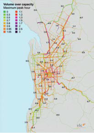
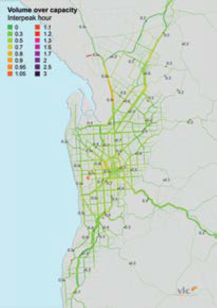
Source: Veitch Lister Consulting (2014f)
The SA Government considers the performance of signalised intersections a more important indicator of network performance than V/C ratios because of Adelaide's extensive at-grade road network. SA Government measures of V/C are significantly different from those in the Audit because of different modelling assumptions. The draft SA Integrated Transport and Land Use Plan identifies the need to invest in a series of targeted intersection improvements to improve the performance of the network.